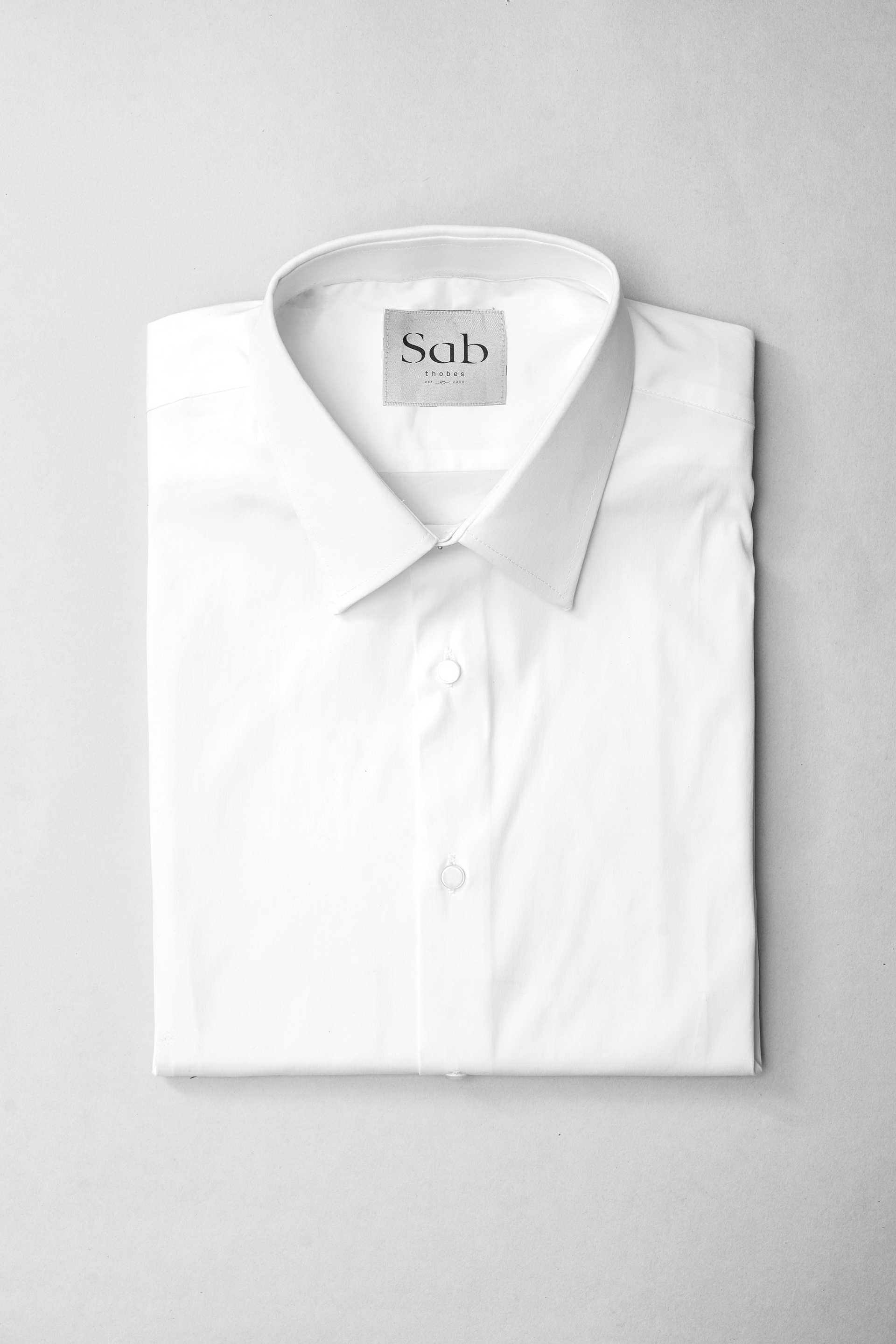
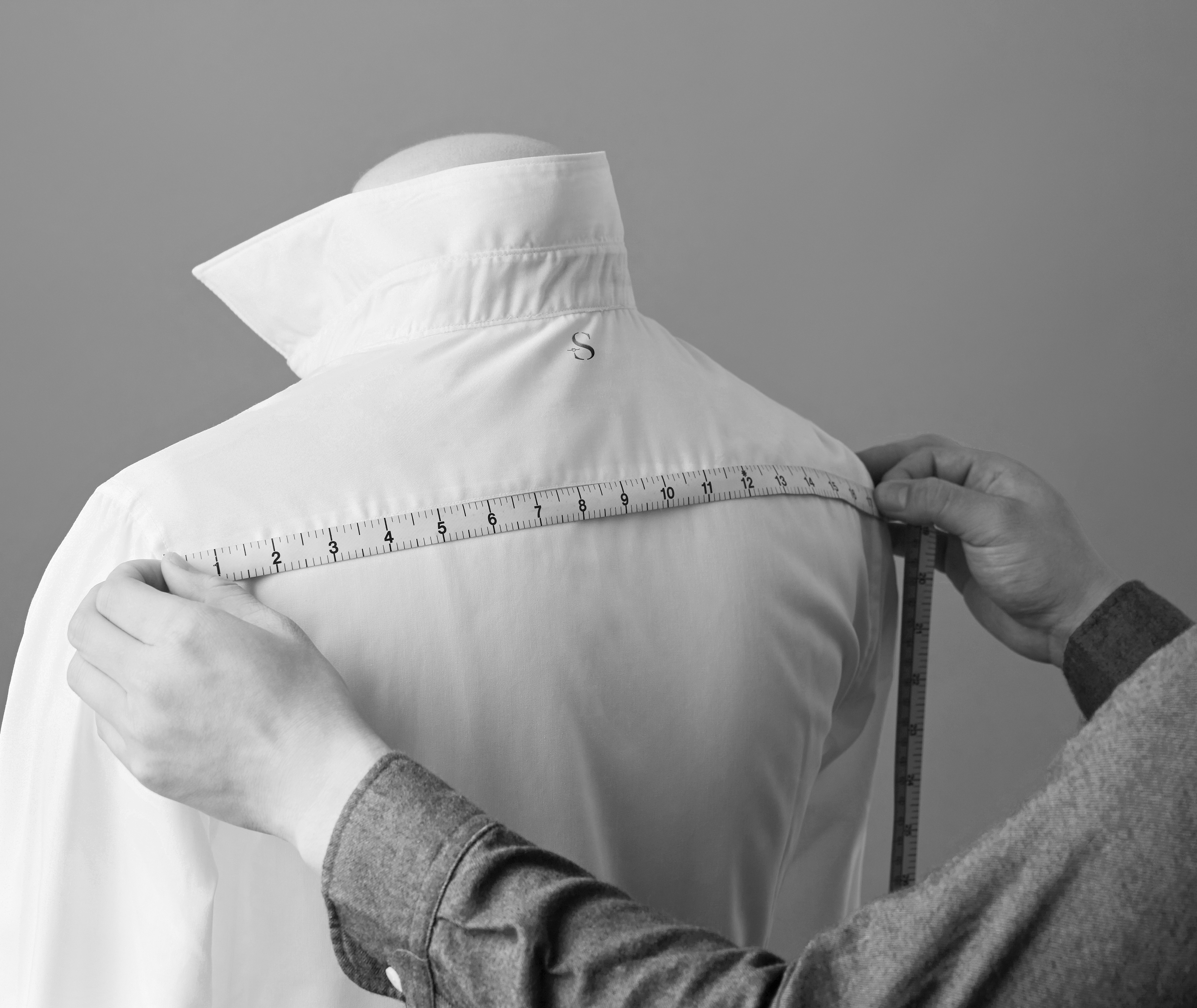
Sab is a men tailoring factory that was established in 2008. It targets men from all ages that live in Saudi Arabia who like to wear thobes on a daily basis or on special occasions to reserve their culture while staying in fashion. After twelve years of establishing the business, Sab needed a timeless rebranding that speaks to its audience and reflects the quality of their products which is consistent in all times.
Inspired by the stitches seen on men's thobes, we created the logotype to reflect sophistication and attention to details that are seen on Sab's thobes. The letters of the name stand out through simple forms where we omitted minor details of the characters to achieve minimalism and create curiosity.
The submark emphasizes on the unique shape of the letter S combined with the establishment date to maintain originality through simplicity. We used black in the brand identity elements to achieve a modern and bold brand identity style and also to contrast
